We simulate 1,000 students competing across 192 colleges over six admission rounds — and we run that simulation 500 times. Here is exactly what's under the hood, with calibration data so you can check our work.
The premise: agents, not formulas
Most chancing tools fit a formula to past admission data: GPA + SAT + extracurriculars → percent. That tells you how the average student with your stats has fared, but it ignores the thing that actually determines who gets in: which other students are competing for the same seats.
We take the opposite approach. We build 1,000 student agents — each with their own academics, hooks, school context, and college list — and let them compete. A college with 1,500 seats and 50,000 applicants admits its top 1,500 by composite score. Your chance is what fraction of simulated cycles you ended up in those 1,500.
192
Colleges modeled
17,884
High schools
6
Admission rounds
500
Cycles simulated
Where the numbers come from
Every quantitative input in our model is sourced from public institutional data, not estimated from anecdote. We update against current cycles each year.
Common Data Set (2024–2025). Per-college acceptance rates, SAT 25th/75th percentiles, yield, ED/EA breakdown, class size, demographics. Each college submits the CDS itself; it is the gold standard.
NCES Private School Survey + state DOE files. Long-list backbone of 17,884 high schools. We blend in 12 state DOEs that publish school-level SAT/ACT means.
IPEDS net price calculator data. Net cost by income bracket — used in the chancing UI, not the admission decision.
Published research. Hook multipliers come from peer-reviewed work on legacy and athletic preferences (Arcidiacono et al.; Hurwitz). ED yield elasticity from Avery & Hoxby. The full bibliography lives in Research.
How a student gets modeled
Each student agent has two axes of identity. The behavioral axis controls what they care about and how they apply: STEM spike, humanities spike, arts spike, athletic spike, well-rounded, average academic. The structural axis controls the resources they bring to the application: high advantage, moderate advantage, neutral, disadvantaged.
On top of that, each student carries an academic profile (GPA, test scores, AP load), holistic signals (extracurriculars, essays, recommendations), and the hook flags admissions offices weight differently — legacy, recruited athlete, development case, first-generation. Traits are sampled from joint distributions calibrated against institutional data, so the simulated population matches what colleges actually see rather than an idealized normal curve. Agents build realistic lists too — balancing reaches, targets, and safeties the way real applicants do, which is part of why our simulated competitive pools track the real ones.
How a decision gets computed
Every applicant–college pair gets scored on a calibrated admission model. The model considers four families of inputs:
Academic strength — GPA and standardized scores measured against the specific college's published distribution, not a national average.
Holistic signals — extracurricular depth, essay quality, recommendations, and the school context the student comes from.
Hooks — legacy, recruited athlete, development, and first-generation status. Each carries a different weight, drawn from peer-reviewed admissions research and per-college disclosed data.
Round & pool effects — applying ED gives a real boost; applying RD into a deep pool is harder. We model both separately.
The exact functional form, weights, and per-college constants are proprietary — but how we ground them isn't: every weight is anchored to a published source or peer-reviewed study, every per-college constant is calibrated against that college's most recent Common Data Set, and the whole model is validated against held-out years before it ships.
Two structural details worth knowing: international students compete for a separate slice of seats per college (3–25% depending on selectivity), so their dynamics don't crowd the domestic pool. And the simulation runs against the implied national applicant pool — your cohort isn't just the visible agents, it's a representative sample of who actually shows up at each school.
The six rounds
Real admissions is sequential. ED commits a student to one school; EA leaves options open; deferrals roll forward; melt happens after May 1. Our engine runs the same sequence — most chancing tools collapse this into a single rate.
Round 1
Early Decision (ED)
Binding. Roughly 12–15% of seats, 40–60% of admits. Students gain a substantial admit-probability boost in exchange for forgoing comparison shopping.
Round 2
Early Action / REA
Non-binding early. Smaller boost than ED but no commitment trade-off. Tier 1 schools that don't offer ED concentrate here.
Round 3
Early Decision II
Second binding round in January. Used by students whose ED1 was rejected or by late deciders.
Round 4
Regular Decision (RD)
The bulk of applications. Largest pool, hardest acceptance rate.
Round 5
Student decisions & melt
Admitted students choose where to enroll based on yield model (preference + cost + fit). Some students "melt" — accept then withdraw before fall.
Round 6
Waitlist activation
If a college misses its yield target after melt, it activates the waitlist to fill remaining seats.
Calibration: how do our rates compare to reality?
Below: all 55 base-mode colleges, one dot each. The x-axis is the published Common Data Set acceptance rate; the y-axis is what our simulation produced, averaged across 200 Monte Carlo runs. The dashed line is perfect calibration (y = x); the green line is the proportional fit.
Predicted vs. published acceptance rate
55 colleges, 200 simulated cycles, base mode. Hover any point for details.
0.82Pearson r — strength of linear fit
0.61Spearman ρ — rank-order match
1.97×Mean simulated/published ratio
Tier 1 — HYPSMTier 2 — Ivy+Tier 3 — Near-IvyTier 4 — SelectiveTier 5 — Top LAC / Public EliteTier 6 — Selective Public
How to read this chart
Two things matter. Points sit close to the green proportional line — a college twice as selective in CDS data is roughly twice as selective in our simulation — and no point is wildly off-axis (Stanford lands near Yale, not near a state flagship). What the model reproduces is relative selectivity: your odds at Stanford relative to Brown are what should drive where you apply, and that ratio is what the calibration shows works.
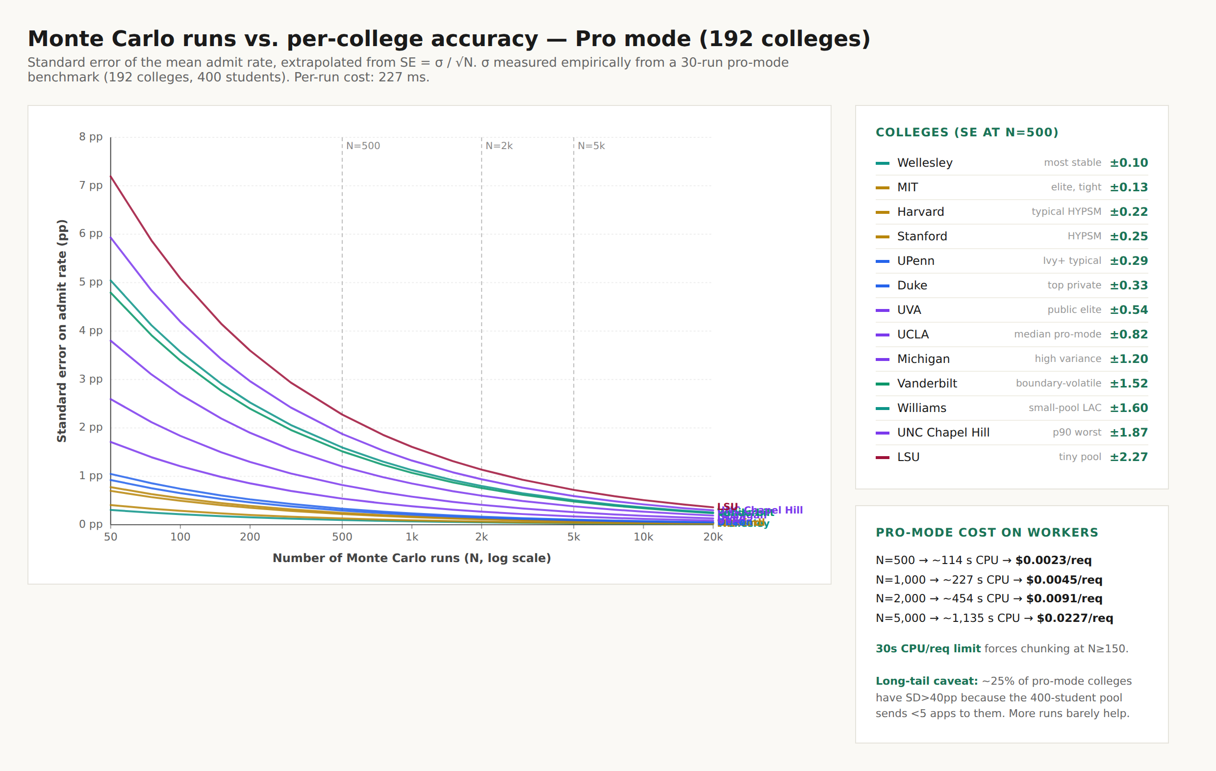
Calibration: precision converges with N
A second view, about precision rather than accuracy. Monte Carlo standard error decays as σ/√N — every run tightens the estimate. This chart tracks per-college standard error from 30 to 5,000 runs and shows where extra compute stops buying precision. (We ship 500 by default — the elbow.)